Design Studio / Concept 017
Keep what clicks.
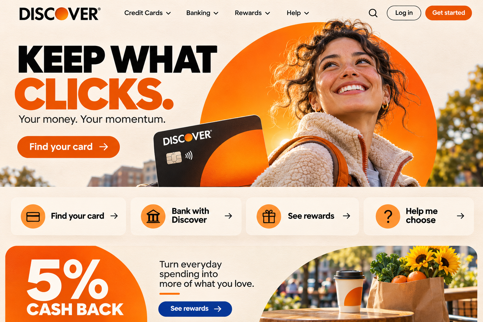
A Discover Card brand and digital experience concept that protects the orange, approachable identity customers recognize while making rewards, product choice and the Capital One transition much clearer.
The opportunity
Give Discover a stronger future without designing away the character people already trust.
Discover occupies a rare position in consumer finance. Its orange disc, direct rewards promise, approachable voice and long association with U.S.-based service give the brand a warmth that most large financial institutions cannot manufacture. After Discover joined Capital One in May 2025, the strategic opportunity is not to make the two brands look interchangeable. It is to make Discover's distinct value easier to recognize while customers navigate an evolving account experience.
Keep What Clicks treats the familiar orange disc as more than a logo. It becomes the organizing device for product discovery, rewards and transition guidance. The homepage leads with human momentum instead of corporate scale, the Rewards Explorer turns rotating categories into a useful visual system, and the Transition Center explains what stays the same, what changes later and what each customer should do next.
02 / Rewards Explorer
Make every quarter feel rewarding.
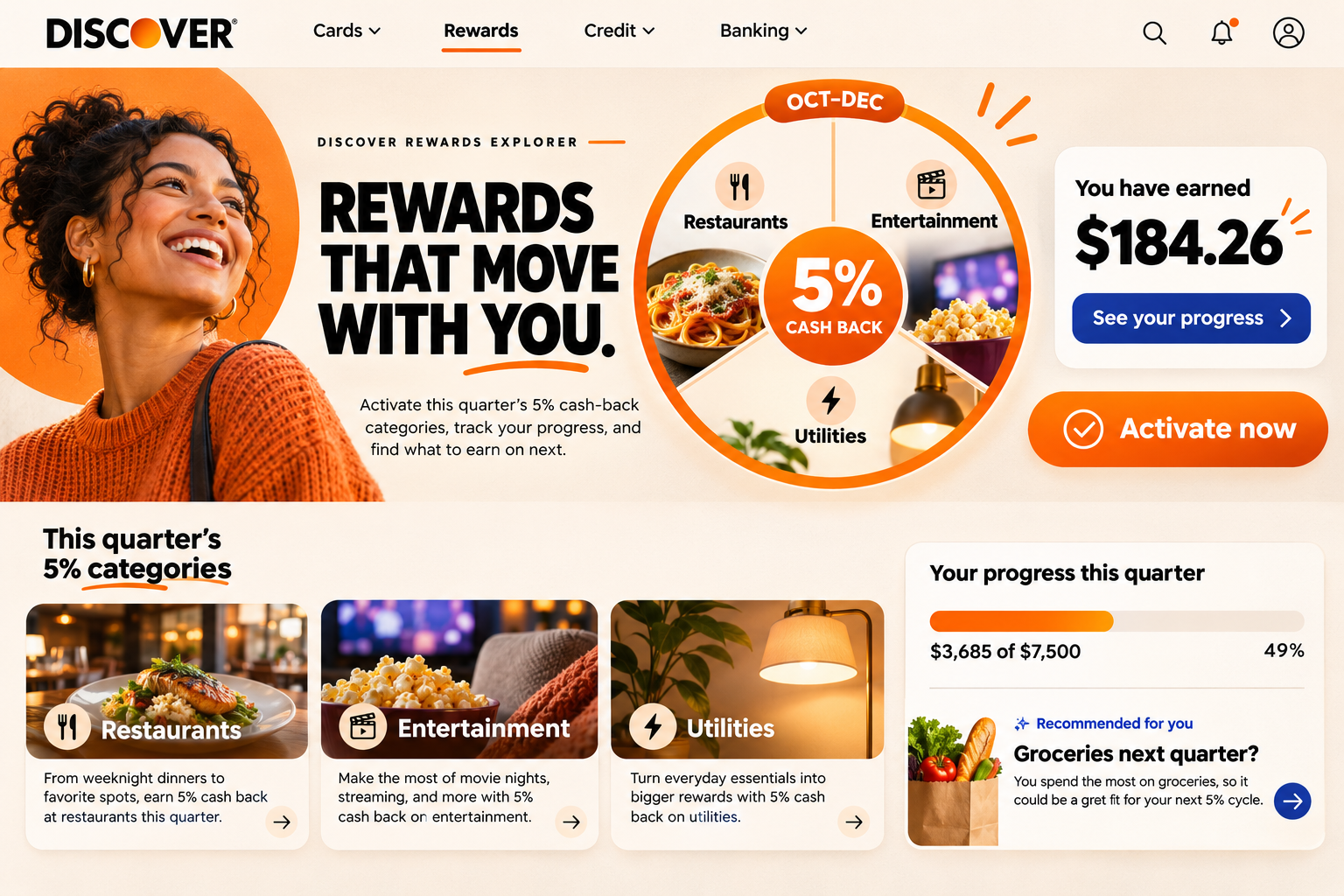
Discover's rotating 5% categories become a visual, personalized product experience. Customers can activate, understand eligible spending, follow progress and see what their everyday purchases are earning without hunting through account menus.
- Interactive quarterly rewards dial
- One-step category activation
- Spend and cash-back progress
- Personalized next-category guidance
03 / Transition Center
A clear path through change.
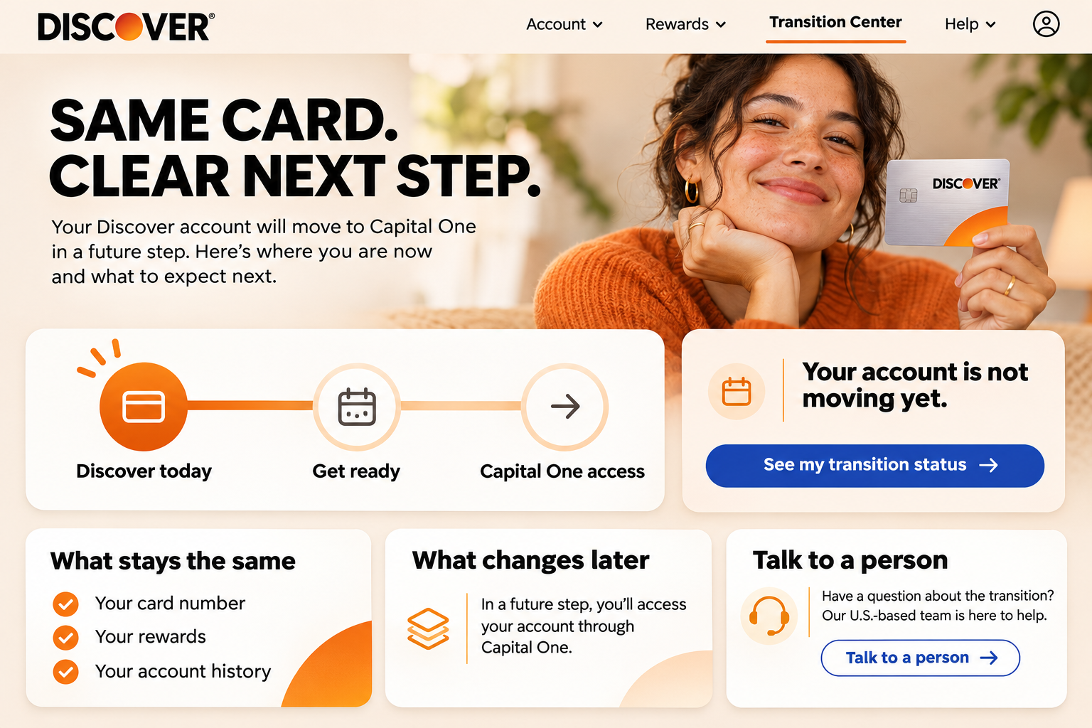
A customer-specific transition center explains whether an account is moving, what remains unchanged and what happens next. The experience keeps Discover's reassuring voice while giving Capital One access the context it needs.
- Personalized transition status
- What stays the same checklist
- Milestone-based next steps
- Direct access to human support
Orange means Discover
The orange disc becomes a flexible frame, progress indicator and navigation signal, giving the brand a proprietary visual behavior instead of another generic banking template.
Rewards become understandable
Cash-back categories, activation and progress are presented as one clear experience so the signature benefit feels useful rather than buried in account mechanics.
Change earns clarity
A personalized transition path replaces broad merger language with direct status, preserved benefits, future steps and immediate access to a real person.
The design why
A preserved brand needs more than a retained name. It needs a digital experience that makes its most recognizable qualities stronger with every click.
Three connected design directions demonstrate the strategy, visual system and user experience opportunity across a complete journey.
Start a special project