Design Studio / Featured work
One portal.
An entire universe.
Monstrous Media Group’s redesign was conceived, designed and built entirely by founder Brad Nietfeldt, a complete digital world where serious business thinking travels with personality, motion and a monster that feels unmistakably alive.
 TRANSFER
READY
01 / The assignment
Build the company’s point of view, not another agency website.
MMG brings strategy, design, technology and growth together. The redesign needed to make that connected model understandable without sanding away the strange, playful identity that made the company memorable in the first place.
Brad approached the site as both founder and maker. Business positioning, information architecture, language, character direction, visual design, interaction and implementation were shaped through one continuous set of decisions. That direct authorship is why the experience feels unusually coherent.
02 / The portal system
Navigation became narrative.
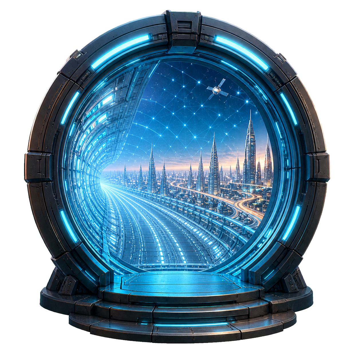
The portal is not a decoration that disappears after the hero. It is the organizing metaphor for the entire site: a transfer point between strategy and execution, Omaha and everywhere, today’s problem and the future on the other side.
Language such as Sector 402, Transfer Ready, Portal Directory and Reopen Portal carries the concept into navigation, transitions, service discovery and the footer. The result is a world with rules, not a collection of sci-fi effects.
- Portal visuals establish movement and possibility
- System language connects otherwise different page types
- Sector 402 gives the global story an Omaha coordinate
- The footer closes the journey with one final joke
OMaha / EverywhereClearance: Questionable
03 / Character with a pulse
A brand character should behave like a character.
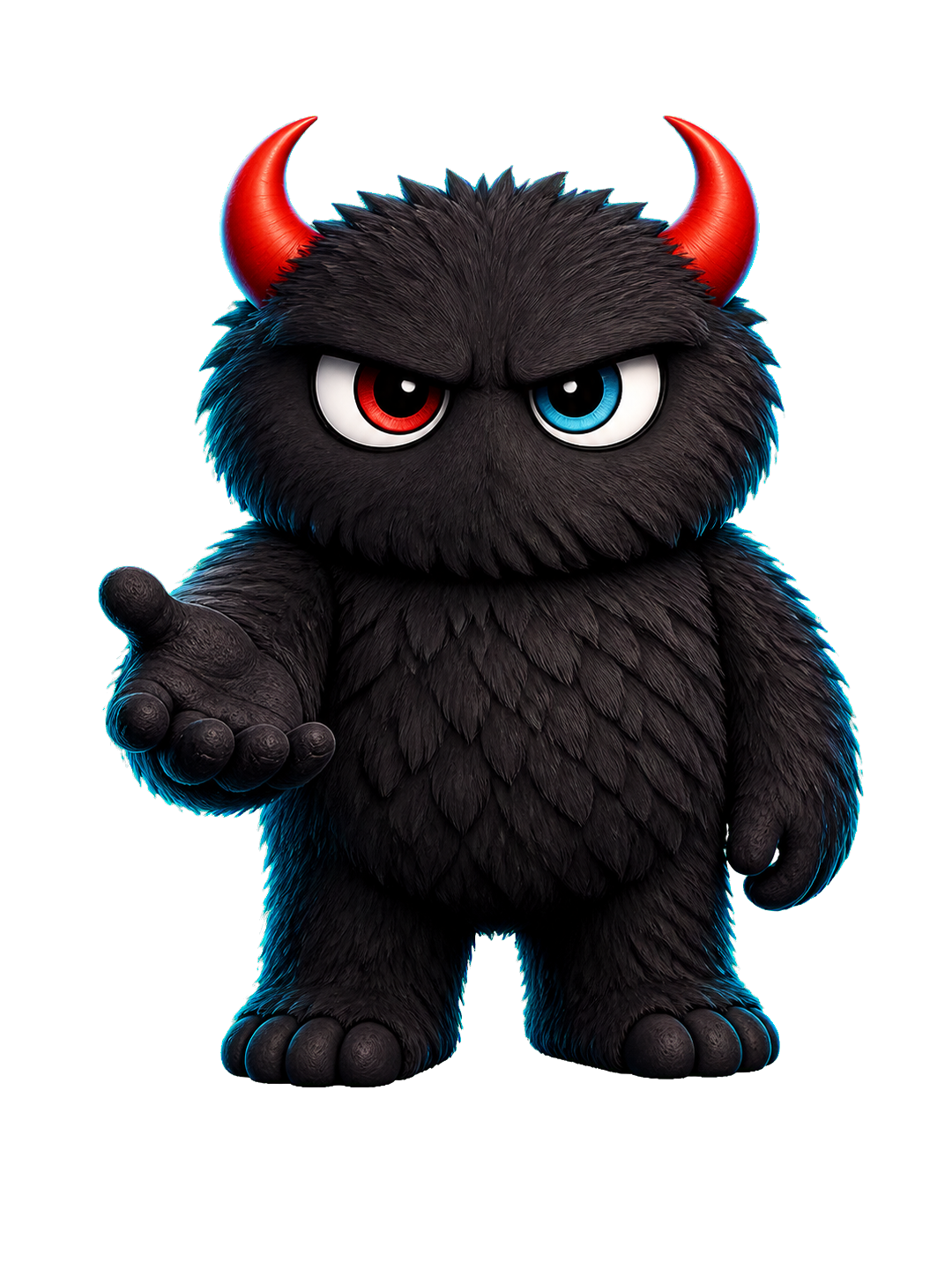
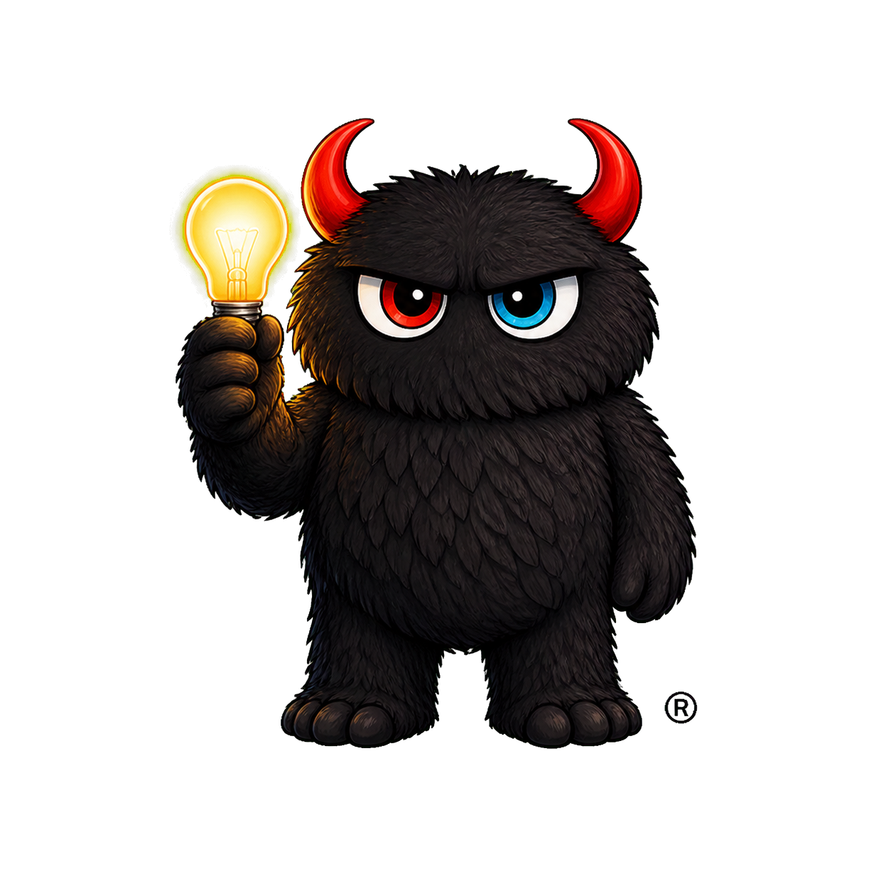
The monster does more than pose. His eyes blink. His attention shifts. Hands point, invite, hold, type and explain. Small gestures give every appearance a job and make the interface feel observed by something with intent.
Those human details matter because the company’s promise depends on the relationship between systems and judgment. The site can talk about AI, applications, media and data, then let a blink or hand movement remind the visitor that experience, taste and accountability still belong to people.
04 / Rewarding attention
The best details wait to be discovered.
Easter eggs turn browsing into participation. They reward the person who reads the tiny labels, notices a change in expression or follows the portal all the way to the footer.
The firmament ice wall
A deadpan piece of portal lore hides beside the opening scene and immediately signals that this world has a sense of humor.
Cow?
A tiny interruption with no business purpose other than surprise, exactly why it is memorable.
Clearance: questionable
Utility language is rewritten as universe-building copy, turning interface furniture into brand voice.
Portal closed safely, mostly
The experience stays in character through its final line instead of abandoning the concept at the footer.
Blinks and glances
Expressions happen quietly enough to feel discovered rather than announced.
Hand signals
Gestures connect the monster to buttons, messages and pathways, making composition and interaction the same decision.
05 / Serious underneath
Play earns attention.
Clarity earns trust.
The portal and monster create recognition, but the structure does the commercial work. Capabilities are grouped into one connected system. Service language is direct. Every important route keeps a practical next step in view.
That balance gives the site range. It can be funny without becoming frivolous, detailed without becoming difficult and highly designed without making a visitor decode the offer.
06 / From the founder
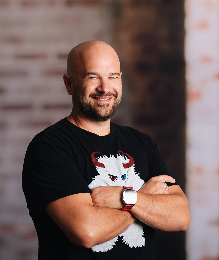
Thirty-five years of technical depth. One very personal build.
Brad’s career spans digital strategy, web development, internet infrastructure, marketing automation and emerging technology. The redesign puts that range into visible form, combining systems thinking with the instinct to make one more detail, one more gesture and one more hidden line feel intentional.
It is a founder’s site in the most literal sense: the person responsible for the company’s direction also took responsibility for how that direction looks, sounds, moves and works.
The result
Serious about the work.
Never boring.
A complete digital identity where copy, architecture, character, motion and code all tell the same story. Built entirely by Brad Nietfeldt, down to the blinks, gestures, hidden jokes and last portal transmission.
Experience the live site